Case Study
Originally written in 2014, with minor changes for the web
Background
The Teaching Grid is a support space for people who teach at the University. One of its remits is to train teachers (lecturers and PGRs) in the use of education technology. Training for SMART Boards is currently delivered by appointment with an Adviser in the Teaching Grid.
Project planning
Identifying the problem to solve
Demand for SMART Board training has remained low despite a demand from the community for training. Surveys at other institutions have shown that while teachers lack confidence in using technology in teaching (Anderson, 2008) and recognise a skills deficit (Loughlin, 2014), the provision of standard training does not impact adoption (Bennett in Loughlin, 2014). In our case, I think the delivery method can be burdensome. There is a need to pre-book, travel to the Teaching Grid and overcome any pride in admitting they want help. Teachers have also shown an avoidance to change, especially regarding the use of technology (Anderson, 2008; Greener, 2010). Additionally, when sessions were booked, Advisers had to refresh their knowledge to prepare for the appointment as much time had passed since the last. I think both of these areas of concern can be improved through the use of available technology.
The goal
In order to attempt a solution to this problem, I aim in this project to:
- increase teacher awareness of the effective use of SMART Boards for teaching and learning
- increase Teaching Grid Adviser confidence in delivering SMART Board training
My measure of success in these aims will be to increase the number of teachers receiving training on SMART Boards and reduce the time spent by Teaching Grid Advisers in preparing for SMART Board training sessions. More teachers receiving training will mean a greater awareness of the training content, including effective teaching and learning use. A reduction in preparation time from Teaching Grid Advisers will signify a greater confidence in their ability to train others on the subject.
Evaluating the app
It is important to plan my evaluation methods before proceeding with the project. Evaluation solely considered after the fact is harder to measure and often coloured by the narrowing viewpoint of the design process. Therefore I will be using a modified version of Kirkpatrick's approach to learning evaluation as described in Activity 3 ;mdash; Designing an evaluation.
Analysis of stakeholder needs
To fully understand students, I need to identify their felt and unfelt needs.
They have a felt need for timely content delivery. Christian Smith,
during a
PGA TEL
seminar, insightfully said [paraphrased],
Students have expectations of quick, up to date and on demand. They
don't realise technology is the best way to do this
. Students' expectations are not met by technology -
they are met
through technology.
Students have (often unfelt) needs in order for effective learning to take place. JISC (2009) have identified features of effective technology-enhanced learning, including:
- allowing learners to choose when, where and how they learn
- adding to rather than replacing existing best practices (e.g. Face-to-face-learning)
- facilitating peer interaction to develop evaluative, reflective and critical thinking skills
- replicating real-world problems
- including guidance from facilitators on appropriate learning strategies
- customised learning experiences
Students feel the need not to be frustrated, a symptom of often unfelt needs regarding learning design. From Laurillard's (1997) template for the design of teaching, I can reduce learner frustration by:
- defining aims and objectives
- defining terms used
- structuring arguments
- providing evidence for suppositions
- illustrating examples
- demonstrating processes
- providing alternative descriptions of concepts known to be often misunderstood
- providing experiences that confront and address those misconceptions
Design
Designing the activity
At the outset, I must choose an appropriate learning theory to
judge whether the learning and teaching processes adopted will
really achieve the intended learning outcomes
(Mayes & De Freitas, 2007, p14). I have decided to
use the Instructional Systems Design of Robert Gagné
(in Mayes & De Freitas, 2007), in which the subject
domain is recursively decomposed into a hierarchy of units. Each unit
is composed of a small number of simpler units. The learner is then
taught the simplest units of knowledge/skill and then units composed
of those already learnt. This is the natural approach as SMART Board
use is easily deconstructed into component skills that build upon each
other.
To ensure that I have considered all aspects of the learning activity, I will use the LeMKE framework (Boettcher, 2007). This splits the design considerations into the learner, the mentor, the knowledge and the environment. I have also considered Laurillard's template for designing teaching (1997), which suggests:
- outlining the knowledge to be taught
- highlighting student misconceptions
- redescribing the misconceived ideas
- have students explore the misconception
- then design the next learning activity to further understanding
Laurillard's approach is more suited for teaching concepts, but I will be mainly teaching skills. That said, I want to make teachers aware of how to link the SMART Board to their pedagogy and not solely teach skills in a vacuum.
Activity
The activity I have designed consists of an iPad app for use either by learners in their own context or by Advisers in the Teaching Grid training them. The app consists of a series of skill explanations, including video examples and text that can be worked through in a non-linear fashion. Below I have outlined the design decisions based on the LeKME model.
Learner
The learners will be PGRs who teach and academic teaching staff. They will be from diverse departments with a spectrum of technical skill levels. They may need to learn a specific SMART Board skill for immediate use in teaching or be interested in finding out what SMART Boards can do for them. Ownership of personal technologies is pervasive, flexible access to resources is considered essential, and it is important to be able to extend communication beyond the Teaching Grid environment (JISC, 2009).
Therefore the activity will:
- include optional support (both real-time and asynchronous)
- include options for learning a specific skill or free-roaming
- be accessible at a place and time of their choosing.
Mentor
The activity will be designed to be completed alone or with a Teaching
Grid Adviser. The learner can also contact an adviser through an
embedded e-mail form in the app or find their phone number. It is
important to blend the learning in this way as the experience of
others has shown that online media used alone falls short
(Macdonald, 2008). One of the reasons for this is that
simply delivering content
becomes the end of the educational transaction rather than the
beginning
(Knox, 2012, p32). This is because teaching and learning
is inescapably and essentially a dialogue
(Laurillard, 1997, p97).
Knowledge
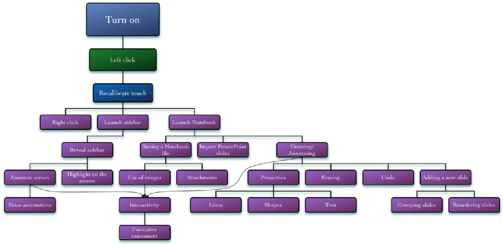
Pulling together my knowledge of what can be done on SMART Boards and
the inbuilt training material, I identified the distinct skills that
make up SMART Board use in teaching. I then analysed each of these to
determine which were prerequisites to learning others. This resulted
in the below tree structure where the root is the most basic skill,
and each node relies on the skill it branches from. Students need not
learn all these skills but
direct and customize their learning according to their own
respective needs and priorities
(Boettcher, 2007).

It is important to not only provide the learner with the skills but also to provide the context and motivation for learning them. This can be furthered by highlighting each skill's relation to others, including what the learner needs to know already (Laurillard, 1997).
Environment
The learner will either be in the Teaching Grid or their own context (office, departmental space or classroom) and will either be using a Teaching Grid provided iPad or their own. They will have internet access available, and ideally, they will have a SMART Board to hand.
Selection of appropriate technology
I have chosen to implement this activity using an electronic resource because it can (adapted from Macdonald, 2008):
- be used even when a mentor is not available
- be easily updated
- be interactive
- provide greater differentiation
- provide multimedia stimulus
- be easily copied, transported and organised
I have chosen to implement this activity as an iPad app. My reasons for choosing to use iPads are:
- they are available for use in the Teaching Grid
- a significant number of target learners have their own or work-provided iPads allowing learners the
- flexibility to learn in their own location and at their chosen time
- they are mobile enough to be held while using a SMART Board
- they can easily be shared collaboratively between the mentor (if present) and learner due to their mobility, screen size and multitouch interface
- they allow easy access to the internet to supplement the provided materials
- they allow easy access to their social networks through text, voice and video to allow learners to collaborate, seek further help and share their successes (an important part of maintaining learner motivation and engagement)
- they can provide multimedia content such as videos, audio and animations.
I have chosen to use a native app instead of a web resource because in
future versions the touch interface could be used to mimic a SMART
Board, aiding learning without the presence of a SMART Board. Kuhlmann
claims screens only allow you to click, hover, and drag
(2012) — which is true of webpages on iPads — but native
apps also allow you to use gestures such as swipes, pinches, pans and
multiple touch points.
Implementation
User Interface
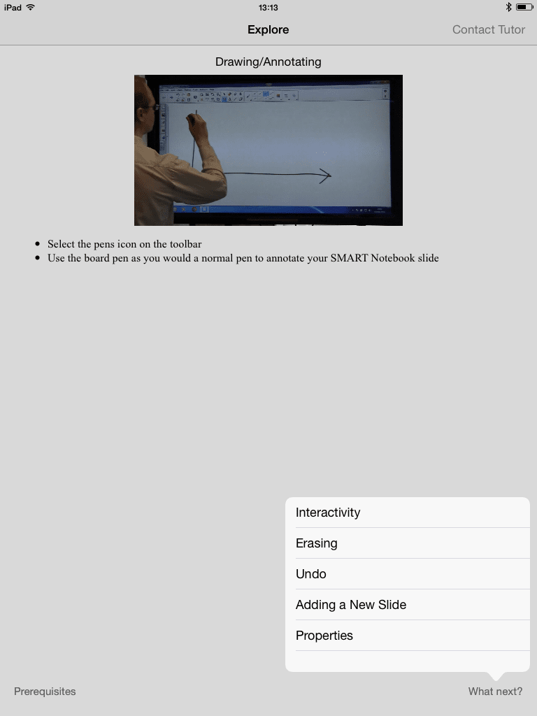
Screen A
This is the Explore mode, where learners can browse freely between the skill nodes.
I decided to go with a minimalist approach - following the iOS 7 design methodology of making the content the main element on the screen. Clicking on "Prerequisites" or "What next?" presents a popover list of topics to navigate to. There is also a button to contact a mentor.

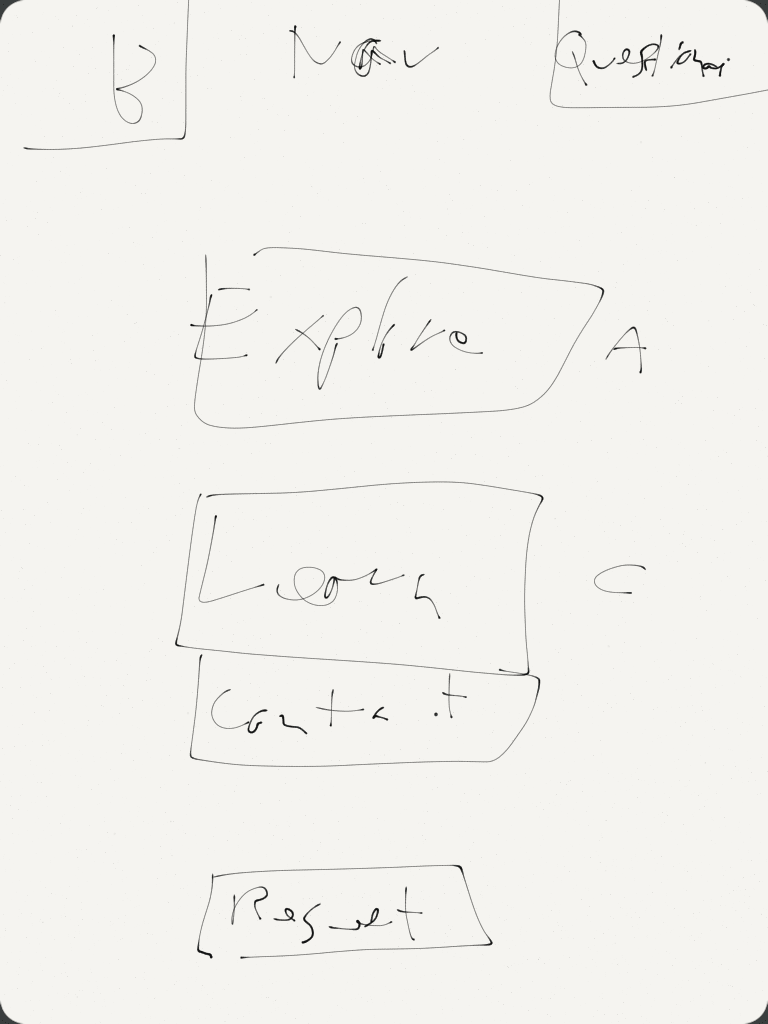
Screen B
In the end, I limited the first version to screen A, but I had planned screen C (see below), and so needed a menu screen.
This screen would let you change between screen A and screen C but also allow you to contact a mentor.

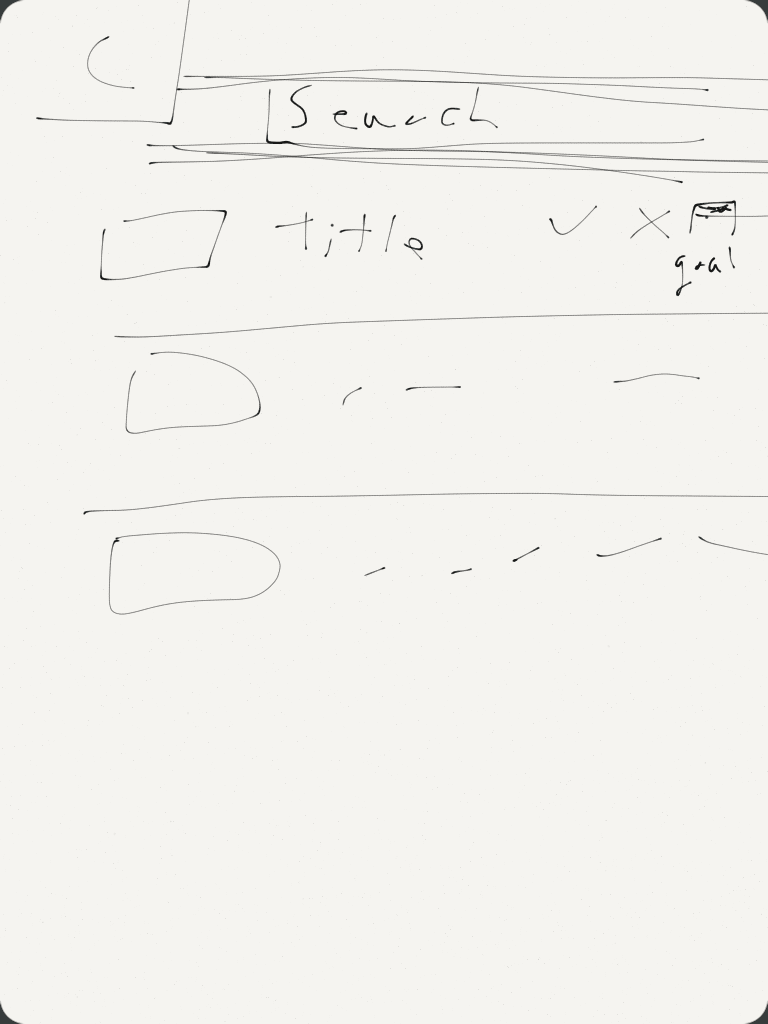
Screen C
I planned but did not implement screen C, which lists all the skills and allows the learner to mark which skills they already know and which skills they would like to set as goals.
The app can then hide skills identified as known and only show missing skills that directly lead to identified goals.

Learning Objects
A Learning Object is a
digital piece of learning material that addresses a clearly
identifiable topic or learning outcome and has the potential to be
reused in different contexts
(Weller et al. in Littlejohn and Pegler, 2007, p182).
Their use can save time and money by being repurposed, recomposed or
swapped out when edits are needed. They can also aid differentiation,
adapt to formative assessment and help learners to otherwise craft
their own learning experiences.
I had done most of this work by identifying discrete skills for each node. However, I needed to decontextualise them further to make true Learning Objects. This meant not mentioning where the video or text appears in relation to the app or other skills, storing the videos and text as discrete resources and programming the app to handle changes in content and skill structure. This last point also has the added benefit of making the app easily adaptable to teaching other technologies simply by replacing the Learning Objects.
See Appendix A for a list of Learning Objects (text and video).
Evaluation
Actual motivation
I gave testers a questionnaire to complete after using the app (Appendix C) to analyse their motivation for the activity.
- Testers struggled to discern the user interface with a divide between those who had used iPad apps and those who had not (those with previous experience fairing better). Learners using this app are more likely to be in the latter camp, so the interface must be adjusted to accommodate this.
- Testers generally felt the app benefited them, but this was not universal. From verbal feedback, this seems to be skewed by testers who already knew SMART Boards well and therefore did not feel they learnt much.
- Many testers felt that, regardless of their own gain, their students would benefit from them using the app. Those reporting little personal gain explained this by the app raising their awareness of how the SMART Boards could be used effectively for teaching.
- Testers said there were things they knew could be done on a SMART Board missing from the app - they wanted the app to cover all features. When showing the SMART Board screen, strobing video effects were distracting, so higher quality versions should be made. They report that a more goal-oriented design would improve motivation — I think implementing my planned screen C would help here.
Actual learning
I tested participants immediately before and after using the app to measure their short-term learning. I did this by observing the testers attempting progressively challenging tasks and rating their performance (Appendix D).
In my analysis, the results were skewed by testers who already knew SMART Boards well. Disregarding testers who scored 100% on the pre-test, there was measurable learning across all tasks. I disregarded these testers as they could not demonstrate any learning, and my evaluation failed to account for this possibility. There were higher gains with the more complex tasks compared to the simpler ones, especially in the area of using SMART Boards for formative assessment. This is a positive sign that the learning was not just superficial but would impact the testers' students.
Breaking down the results by task and disregarding testers who had “fully completed” that particular pre-test task highlighted that they demonstrated dramatic gains in areas they lacked. This was even if a tester did not demonstrate significant gains overall. Except for one tester in one task, every tester in this situation made progress — with a skew towards the simpler tasks.
This demonstrates that the learners this is aimed at will make significant learning gains in using the app. How this would compare to a 1-2-1 tutorial has not been tested. However, the app will open up the possibility of learning in their own space, time and pace compared to 1-2-1 tuition.
Actual performance
It is too early to say if actual performance in the classroom has improved. I plan to survey testers in one term to see if they have embedded their learning in their teaching.
Actual result
Again, it is too early to say if actual results have been achieved. I plan to survey participants in one term to see if the testers' students' experience has improved.
Choice of technology
Using Walker's Evaluation Rubric For iPod/iPad Apps (2011), the app scores the following:
-
Curriculum Connection = 4/4 (
Skill(s) reinforced are strongly connected to the targeted skill or concept
) - Authenticity = N/A (The nature of the app means it could be used in authentic or non-authentic scenarios)
- Feedback = N/A (The app cannot provide feedback on what the learner is doing on a SMART Board)
-
Differentiation = 1/4 (
App offers no flexibility to adjust settings to meet student needs (settings cannot be altered)
) -
User Friendliness = 3/4 (
Students need to have the teacher review how to use the app
) - Student Motivation = N/A (The app is not available for general use yet, and this aspect is more aimed at school use evaluation)
- Reporting = N/A (The app is not designed to assess learners summatively)
This gives an overall score of 8/12 (67%). I could increase this score
by adding differentiation through a self-evaluation screen (see Screen
C). The learner would be presented with a list of skills and could
mark them as either already learnt or goals to achieve. The app would
then only present skills that are not already known but are required
to learn the goal skills. This is similar to the custom quizzes
described by Ryan, Scott, Freeman and Patel (2000), where
the next question presented to learners is chosen based on their
previous performance. It is difficult to do anything but self-assess
skill competency as
it is not possible to demonstrate the thought processes that lie
behind an answer, and there is no opportunity for partial marks
(Jacobson & Kremer, in BECTA, 2007, p23). Ideally,
the app will be used with a mentor. I could also improve the score by
improving user-friendliness by graphically displaying the skills tree
in navigation. Many testers said that it was not clear that the skills
were structured like this. It would be helpful to have an overview of
what skills were included and to be able to navigate to them quickly.
Dissemination strategy
I plan to:
- present the work at a Technology Enhanced Learning Forum at the University
- send a copy of the case study to testers
- publish the case study and resources on a webpage for University staff
- put the app into usage by Teaching Grid Advisers
- after refining the app design, I may publish the source code publicly so anyone can add their own content.
Appendix
(by request)
- Appendix A: Learning Objects
- Appendix B: Code
- Appendix C: Post test questionnaire
- Appendix D: Assessment of learning